


Last summer on a 10,000 mile road trip across America I noticed a sign I’ve taken for granted for decades. It’s the children-at-play sign, a bright yellow steel rectangle with the silhouette of a running boy at its center. The newest version shows a gender-neutral stick figure running, but you can find the older versions in nearly every city. Perhaps the most common is the tousle-haired boy wearing belted shorts and a long-sleeved pullover. This images is so old, circa 1930-40, I’m amazed it still exists.
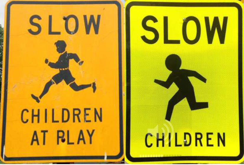
In fact, it exists in such great numbers, I wonder if it has survived only because the image is convenient (that is, a public-domain freebie) or because it’s compelling. The boy is slender, shown in full stride. Clearly, he’s athletic, swinging his arms freely, his limbs loose. If he is objectionable now, and increasingly replaced by the stick figure—which one sign aficionado calls “Helvetica Man”—it’s because he (the old version) is so clearly privileged: a well-dressed, white male. Certainly girls run as well as boys. And Kenyans run better than anybody. But here he is, the now-antique All-American white Running Boy, in nearly every American city and town, still making his mark decades after his first. If you doubt the age of the Running Boy, you have only to look at his clothes, starting with his shoes, which are obviously leather. A boy wearing a long-sleeved pullover tucked into belted shorts, with leather shoes, could only be a boy running to or from school, no later than 1960 but more likely 1950 or earlier. The 1930s-40s were the days of boys wearing “short pants” until they were teenagers, at which point they were allowed to wear trousers to make their transition to adulthood.
Knowing this, we may understand why the designer, in choosing a boy over a girl, was not simply expressing sexism. A running ............
boy was a more easily deciphered symbol. The silhouette of a running girl in a skirt might not look like a child, whereas a male figure in short pants was clearly a child. Also, since boys (especially in the past) would be more inclined to sprint than girls and usually sprint faster, a running boy may have looked like more of a danger, much the way we think of deer darting into the road.
But the sign sends a mixed message. The boy may be running in play and thus symbolize the happy abandonment of youth or he may be running into traffic, oblivious of the consequences, and thus signal danger, even chaos. The latter describes how my neighbor, four-year-old Gregory Jones, nearly killed himself when he darted into the path of an oncoming car. My brother, who was with him at the time, said later to the police, “It was like he waited till the last minute, then he ran, even after I told him to wait!” Studies have determined that children have poor spatial acuity and can’t accurately judge distances, much less gauge the speed of oncoming objects or their chances of matching that speed. I remember watching with fascination the woman who had hit Gregory, the bumper of her Chevrolet having split open his head. She held him to her shoulder until the ambulance ............
arrived and then, in shock, stood in the roadway staring after it, a massive red blossom at the shoulder of her white blouse.
I’ve always assumed safety signs like the Running Boy were sanctioned, if not manufactured, by the federal government. On the contrary, the Feds discourage the use of such signs because there is no evidence they’re effective. Critics of the children-at-play signs argue, ironically, these signs send the wrong message, suggesting to children that playing in the street is okay. Local municipalities actually started making street safety signs in the 1920s in response to the sudden, startling pedestrian accident rates they witnessed in their newly automobilized streets. The Lyle Sign Company, established in 1928, was one of the first manufacturers of street safety signs commissioned, it is thought, by an automobile club. The president of another long-lived sign company, Smartsign, informed me that their old-style Running Boy sign accounts for nearly 40% of their sales of children-at-play signs, of which there are a dozen varieties.
It may be fair to assume that when these signs first appeared in the early decades of the twentieth century, children were indeed playing in the streets and in far greater numbers than they are ............
today because, at the time, playgrounds were fewer in number and, in cities especially, the street was the most level, accessible place for play. When I was a kid, we sometimes played whiffle ball in the street and, of course, were always riding our bikes there. Nowhere was street play more prevalent than among skateboarders and snow sledders and, during certain decades, roller skaters, then roller bladers. In other words, parents’ fears have been well-grounded in the asphalt thoroughfares that course their neighborhoods.
When I first learned to drive I was appalled at the number of dead squirrels I saw on the road. Noting their smeared leavings and mangled bodies every mile, I was convinced I was witnessing the result of a viral pandemic that sent dying squirrels into the streets. Soon, I realized the truth, that squirrels—like children—are not good at judging the speed of oncoming vehicles. I can’t recall ever running over a squirrel, but I’ve seen it happen and it seems clear that, generally, drivers don’t know when they’ve run one over. Let me confess: I have a great fear of running over a child. To my mind, playing children are as mindless as squirrels. And so, contrary to the argument that drivers don’t heed the children-at-play sign, these signs always make me slow down.
An anthropologist might point out that we still have a problem with children running into the streets because, while it took us millions of years to adapt to the methods and limits of walking, it has taken us little over a century to accommodate the complexities of walking next to or into streets with vehicular traffic. We simply haven’t had enough time to adapt. I recall my parents and teachers lectured on the dangers of the street and stressed “looking both ways.” But I recall, too, how welcoming the street was, especially its warmed asphalt aroma, its guttered jetsam of chromed nuts and bolts, colorful wrappers and wads, gleaming trinkets and loose change, its broad seemingly hospitable expanse and beckoning horizon, and then there was the monstrous thrill of passing traffic, the cars and trucks racing by so closely I could feel the heat of their huge steel bodies and their draft pulling me in a terrifyingly seductive way, then enveloping me in the pleasing stink of their exhaust. I wonder now: did families two millennia ago let their children play unsupervised?
When considering the Running Boy and which version we prefer—the old style or the new—we’re talking about much more than aesthetics: we’re talking about the survival of our species. The ............
sign matters. This is why the contemporary version of Running Boy—that “Helvetica Man”—bothers me. Little more than a noodled cipher, it leaves me cold. There’s nothing human about it, and so nothing compelling. What the Running Boy has that Helvetica Man does not is a sense of purpose and, dare I say it, joy. Running Boy is going somewhere (home! school! play!) and fast; he’s caught at the moment of ultimate transport. Literally. Helvetica Man’s abstraction conveys but one message—caution! —while Running Boy seems to convey two or three. Running Boy transcends his banal function and engages the viewer in a larger context: the life of human community.
Maybe that’s a problem for contemporary designers who strive for simplicity above all: they champion the symbol that carries the least interference. But it’s not as though the originator of the Running Boy was blind to this ideal. After all, the Running Boy is seemingly unencumbered: he carries no books (in his day, they would have been bundled and tied with a rubber strap), he holds no bat or racket or stick or ball, he clutches no flag or pinwheel or pennant. But look again and you see the boy is actually thoroughly encumbered—by his leather shoes, his belted shorts, his long-sleeved pullover, even the forelock above his brow, all of ............
which trap him in time, making him too much the boy running from the past. In the end, his encumbrances make him quaint and, ultimately, distracting.
Recently, I talked to a number of graphic designers about Running Boy and his post-modern counterpart. Their opinions were thoroughly professional, which is to say unemotional: they saw benefits and detriments in both images. As Ellen Lupton pointed out, neither would work without the text. Still, I took secret pleasure in hearing her call Helvetica Man “brutally abstract” and more pleasure when designer Richard Rose referred to him as the fugitive icon from a Men’s room door. “Simpler symbols are not always the best,” the president of Smartsign told me later. He admitted to liking Running Boy more than was reasonable. But he’s a collector of old signs. And now I find myself wanting to champion this old image too.
The antique Running Boy is charming, but his charm is similar to that of, say, an old gas station whose architecture I appreciate but whose segregated water fountains I abhor. Running Boy’s world is the neatly sealed landscape of primary colors, the Dick and Jane world I knew as a child in the 1960s, the world that ............
seemed to know no contradictions and no irony—which is why nobody saw the “slow children” joke back in the day. Granted, Running Boy makes an easy target now because we have moved on and he has not. Like the times that made him, he isn’t nearly as clear as he could be. And this lack of clarity—the ways he might transport some of us to “a simpler time” —probably accounts for his popularity because, to parents who want to protect their children, the argument for caution signs is purely emotional. That’s not to say that Helvetica Man offers any comfort. I still don’t like him, but he’s probably a better sign because he has but one message. This clarity allows Helvetica Man to depict more precisely the danger of the streets and, unlike Running Boy, to represent all of the children we hope he might protect. Look for them both in nearby neighborhoods. You’ll be struck by how earnestly Running Boy looks like he’s in a race, as if he knows how soon he’ll be overtaken.
![]()